












Google Stitch Prompt Guide and Best Examples for 2026
Stitch reinterprets a whole screen when a prompt is vague. The wording that keeps a layout stable, with examples of exactly what breaks it.
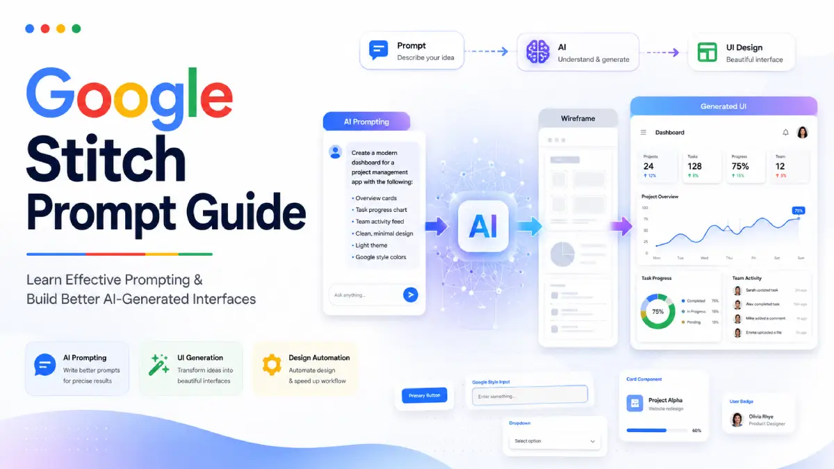
Google Stitch rebuilds more than you ask it to. Request one extra button and it can hand back a screen with different spacing, a new colour and a component nobody mentioned. That is not randomness. Stitch reads each prompt as a fresh description of the whole screen rather than as an edit to the previous one, so loose wording leaves it room to reinterpret everything.
This guide covers the prompt patterns that keep Stitch's output stable, with side by side examples of the wording that holds a layout together and the wording that quietly invites a rewrite.
Google Stitch is a powerful AI-powered interface design tool, but its results depend heavily on how you write prompts. Small changes in wording can dramatically affect the generated design. Understanding effective prompting can save hours of redesign work and help you create professional interfaces faster.
Everything below is drawn from Google's own Stitch prompting recommendations and tested against real screens: the wording that holds a layout, the mistakes that break one, and the workflows that survive a whole project.
Whether you're a designer, developer, entrepreneur, or product manager, this guide will help you get more reliable and predictable outcomes from Stitch.
Core Rule of the Google Stitch Prompt Guide
The most important lesson is simple:
Start broad, then refine incrementally.
Instead of describing an entire application in extreme detail from the beginning, create a foundation first and then improve individual screens step-by-step.
Recommended Workflow
| Stage | Goal |
|---|---|
| Step 1 | Create overall app concept |
| Step 2 | Generate primary screens |
| Step 3 | Refine one screen at a time |
| Step 4 | Modify individual components |
| Step 5 | Improve colors, typography, and imagery |
| Step 6 | Final polish and testing |
This process gives Stitch a stable foundation and reduces unwanted redesigns.
Set the Vibe with Adjectives
Many users overlook this technique.
Adjectives strongly influence:
- Color schemes
- Typography
- Imagery
- Layout personality
- User experience tone
Example 1
A vibrant and encouraging fitness tracking app.
Example 2
A minimalist and focused meditation app.
Notice that neither prompt specifies colors or fonts directly, yet Stitch can infer different visual directions.
Google Stitch Prompt Examples for Better Results
Let's examine practical examples.
Example: Fitness App
Prompt
Create a fitness coaching application for beginner runners. Use a modern and energetic design with motivational visuals and progress tracking.
Example: Productivity App
Prompt
Create a minimalist productivity dashboard for remote teams with task management, team updates, and calendar integration.
Example: Learning Platform
Prompt
Design an online learning platform with course browsing, progress tracking, quizzes, and certification management.
These examples give Stitch enough context without overwhelming it.
Refining Your App Screen by Screen
One of the most important sections of this Google Stitch Prompt Guide is learning how to refine designs properly.
Google recommends making specific, incremental changes.
Good Prompt
On the homepage, add a search bar to the header.
Good Prompt
Increase the size of the primary call-to-action button on the login screen and use the brand's blue color.
Poor Prompt
Redesign the homepage, add search, improve colors, change navigation, move buttons, add icons, and update the layout.
The poor example introduces too many variables simultaneously.
Real-World Case Study: Factory Operator Dashboard
A practical example demonstrates why prompt discipline matters.
I spent a lot of time trying to build a task dashboard for factory operators where each task had two rows.
The first row displayed:
- Task title
- Operator name
- Sector
- Machine
- Deadline
- Status
The second row displayed the full task description spanning the width of the table.
At first, Stitch created the structure perfectly.
The problems began when additional changes were introduced.
Prompt 1: Create the Table Structure
Create a web dashboard to display a task list for factory operators.
Each task should appear as two rows.
First row: Task title, Operator name, Sector, Machine, Deadline, and Status.
Second row: Task description that spans the full width below the first row.
Use a clean, modern style suitable for fullscreen display in an industrial setting.
Prompt 2: Add Filters
Above the task table, add a horizontal row of filter dropdowns for:
- Task title
- Operator name
- Sector
- Machine
- Deadline
- Status
The filters should be evenly spaced and styled minimally.
Prompt 3: Align the Title and Add Settings
Move the page title to the left side of the screen, aligned with the task table.
Add a small gear icon to the top-right corner of the screen for admin settings access.
Following this process fixed the dashboard completely.
The lesson is simple:
Use short, focused prompts and avoid combining features in one request.
This is one of the most useful Google Stitch Prompt Examples for building complex dashboards and business applications.
What Went Wrong
My first prompt worked perfectly because it focused on a single objective.
After that, I asked Stitch to add filter dropdowns.
Instead of preserving the layout, Stitch recreated large parts of the screen and broke the structure.
Every time multiple changes were combined into a single prompt, Stitch started forgetting the original design.
Examples included:
- Adding filters and changing page title alignment
- Adding filters and icons together
- Mixing layout updates with UI component changes
The more changes included in a prompt, the more likely Stitch was to rebuild the screen.
What Finally Worked
After significant trial and error, the solution was to break everything into small, focused prompts.
Designing E-Commerce Pages with Stitch
Stitch performs particularly well when screen goals are clearly defined.
Example: Tea Store Product Page
Product detail page for a Japandi-styled tea store. Sells herbal teas and ceramics. Neutral minimal colors, black buttons, soft elegant font.
Example: Athletic Apparel Store
Product detail page for Japanese workwear-inspired men's athletic apparel. Dark minimal design, dark blue primary color, natural fabrics, and subtle imagery.
These prompts define both functionality and visual style.
How to Modify Images in Stitch
Image editing works best when you clearly identify the image you want to modify.
Targeting General Images
Change the background of all product images on the landing page to light taupe.
Targeting a Specific Image
On the Team page, update the image of Dr. Carter and change her lab coat to black.
Specific references improve accuracy.
Matching Images with Theme Changes
When changing theme colors, also update imagery.
Example
Update the theme to light orange. Ensure all images and illustrative icons match the new color scheme.
This helps maintain consistency throughout the application.
Changing App Language
Localization is straightforward.
Example Prompt
Switch all product copy and button text to Spanish.
AI Prompt Writing Tips for Stitch
These AI Prompt Writing Tips consistently improve results.
Be Clear and Concise
Avoid vague instructions.
Use UI and UX Keywords
Helpful terms include:
- Navigation bar
- Hero section
- Sidebar
- Card layout
- Dashboard widget
- Call-to-action button
- Modal window
Reference Elements Specifically
Instead of saying:
Change the button.
Use:
Change the primary button on the sign-up form.
Specific instructions create better outcomes.
Review and Refine
If Stitch does not produce the desired result:
- Rephrase the prompt
- Add context
- Reduce complexity
- Focus on one change
Best Google AI Prompt Examples
SaaS Dashboard
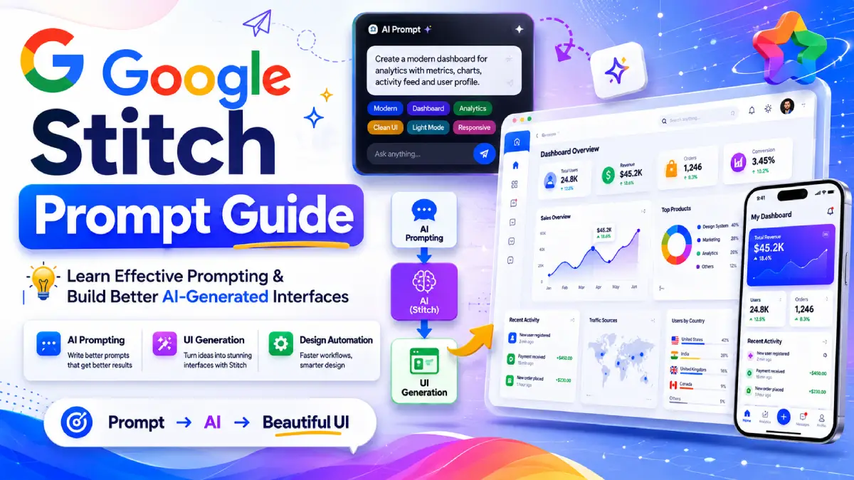
Create a SaaS analytics dashboard with KPI cards, charts, activity feeds, and sidebar navigation. Use a clean and professional design.
Healthcare Application
Design a patient appointment management system with scheduling, reminders, doctor profiles, and secure messaging.
Real Estate Platform
Create a property listing platform with search filters, map integration, saved properties, and agent contact forms.
Education Platform
Design a student learning portal with courses, quizzes, certificates, and progress tracking.
Stitch Prompt Tutorial: Recommended Workflow
A simple workflow used by experienced users:
Phase 1: Create Foundation
Generate the core application screens.
Phase 2: Refine Layout
Adjust positioning and structure.
Phase 3: Add Components
Introduce menus, filters, forms, and widgets.
Phase 4: Customize Theme
Apply colors, fonts, imagery, and branding.
Phase 5: Polish
Improve spacing, responsiveness, and visual consistency.
Phase 6: Export
Sabir's take
The habit that fixed this for me was naming the component before describing the change. Stitch treats a vague instruction as licence to reinterpret the whole screen, and once you see that, the output stops feeling random. I still would not reach for it on dense data screens. Tables with many columns need correcting by hand however carefully the prompt is written.
Frequently Asked Questions
Start with a high-level prompt that describes the purpose of your app. Refine individual screens afterward.
This usually happens when prompts contain multiple unrelated changes or overly broad instructions.
One major change at a time is generally the safest and most reliable approach.
Yes. Stitch supports updates to colors, typography, imagery, and component styling through targeted prompts.
Not always. High-level prompts are useful for brainstorming, while detailed prompts are better for production-ready screens.
Terms such as navigation bar, sidebar, hero section, card layout, modal, and call-to-action button often improve results.
Yes. You can request language changes using prompts such as switching all product copy and button text to Spanish.
Where Stitch Still Falls Short
Two habits do most of the work here: change one thing per prompt, and name the component you are changing. Nearly every broken layout in this guide came from ignoring one of them.
Stitch is still weakest on dense data screens. If you are building a table with many columns, expect to correct spacing by hand however carefully you prompt. Treat what it returns as a fast first draft of a layout rather than a finished design.
- Start broad
- Refine gradually
- Focus on one change at a time
- Use clear UI terminology
- Reference specific screens and components
Stitch is one of several places prompt wording decides the output; the same discipline shows up in the content prompt library and in framework-based prompting. Google documents its own guidance in the Stitch product docs.

Sabir
Founder of AIToolsay and a passionate AI enthusiast dedicated to building practical, user-friendly AI tools that simplify everyday tasks.
Discussion 0
Join the conversation — share your thoughts, ask questions, help others.
Be respectful. Comments are moderated.
No comments yet
Be the first to share your thoughts on this article.
Want more AIToolsay stories in your Google Search results?